Confettii
An end-to-end app design that helps parents book a party venue for their children.
Role: Product Designer
Scope of Work: User Research, UX Design, Visual Design, Prototyping, Usability Testing
Tools: Figma, Whimsical, Miro
Problem
Why is the process of finding a kids’ party venue so difficult and time-consuming? Previously, there wasn’t a resource that existed to pull this information together to help parents or caregivers make a choice.
“There are so many kids party venues out there. I have no idea how to go about finding the best one!”
Solution
Confettii offers a better way to search for and book a venue. It connects parents looking for a venue to businesses with available reservations. Venues fit within a variety of price ranges, activities, and amenities. Users can search, set party preferences, book, and pay through the app. Additionally, users can “pay it forward” by adding venues to the app that they love, as well as adding photos and reviews to help future users with their search.
Empathize
Plan
I looked at comparable apps that are on the market and looked at direct and indirect competitors in the party planning space. Additionally, I scheduled user interviews to collect data about their past experiences booking a venue.
Goals
To create an app where users can search for party venues by filtering preferences.
Objectives
I want to understand what users find enjoyable and frustrating about the search process. I want to understand the key factors that determine which venue they choose.
Competitive Analysis
This analysis allowed me to learn about competitors in the industry. Peerspace and Giggster were the closest in terms of direct competitors however, they focus on providing party venues for adults or for commercial use. Next, I developed a few provisional personas. This helped me to think about what types of potential customers would be looking to book a child’s party venue.

Survey
I created a survey to compile quantitative data about the methods users used to book a venue and the key factors that were important to them. The survey consisted of 12 questions, and I received 2 responses.
Key Takeaways:
-100% of users found distance, price, date availability, and meeting kids’ interests important factors.
-100% users found coordinating food and favors frustrating.

User Interviews
I spoke to 3 participants via phone interviews to collect qualitative data on users who have planned parties for their children. The interviews gave me valuable insights into people’s perspectives, pain points, and needs. This proved helpful when creating my user personas and feature roadmap.

-
![]()
“Organizing parties is the worst thing for parents. It's ALOT!”
Paula, mom of 2
-
![]()
“I like a venue where everything is handled. People can just show up."
Meredith, mom of 2
-
![]()
“I want to be able to go online, see availability and book it right there."”
Silvia, mom of 2


Define
User Persona
The feedback I gathered from user interviews had many similarities. As a result, I decided to develop one user persona for this project. Meet Mindy!
-Mindy is married and has two children. She is looking to plan a birthday party for her daughter. Due to her limited time, she can’t spend hours searching on Google to find a perfect venue.

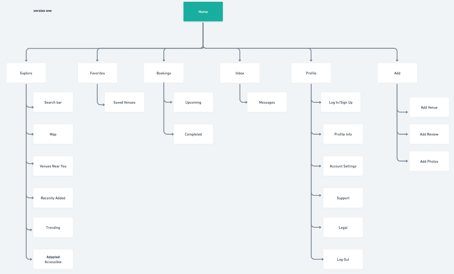
Sitemap
For the next phase of the project, I determined based on my user feedback, that I needed to design an explore screen that would allow users to customize their search based on various filters.
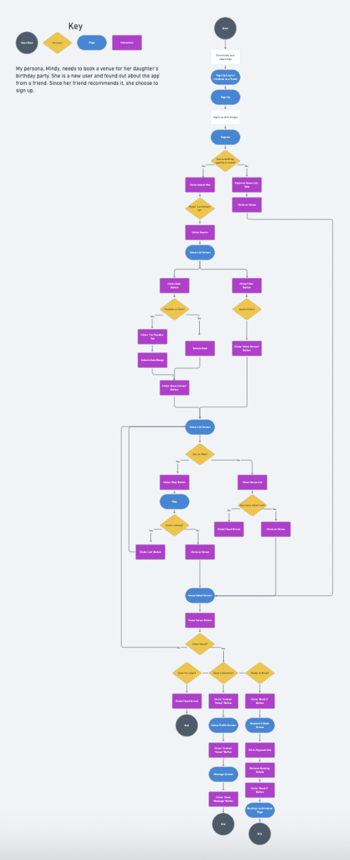
Task and User Flows
Keeping Mindy in mind, I created a task flow where she could sign up for Confettii, and by applying filters based on her needs, narrow down her search and ultimately book a party venue. I also created a user flow in which Mindy signs up for Confettii and included the different paths she could take in order to customize her search to find the right venue.

Ideate
Sketches
Incorporating the user flow, I sketched ideas for how the wireframes would look.


Wireframes
Next, I digitized the wireframes in Figma in preparation for my first round of testing.

Prototype
Wireframe Testing
I tested this first version of my wireframes with 3 participants in-person and via Zoom.
After feedback, the following iterations were made to the wireframes:
Input fields for the sign up/sign in process were flipped as users prefer to manually enter email address and password
Consolidating input search fields
Editing of content such as “time frame” and “age range” so they are more intuitive
Providing more transparency for pricing and amenities on the venue detail screen.

UI Design
I created a logo, color palette, and typography to be used throughout. Additionally, I created a UI kit that included all the elements used within the app’s various screens.


Prototype
In preparation for usability testing, I implemented the elements from my UI kit and made adjustments to my wireframes based on the feedback from my initial testing, in order to create a mid-fidelity prototype.

Test
Usability Testing
I tested my prototype with 3 participants via Zoom.
Objectives:
- Test the ease of use
-Can users apply filters to narrow their search?
-Is there enough information about a venue provided?
-Test if the booking process is efficient
Key takeaways:
-Price, location, and date are the most important
-Users want the ability to pay deposits only
-Users want to contact venue by phone
-Pricing and cancellation policy need to be transparent


Next, I created an affinity map to compile all of the data in order to form a priority list for iterations.
Iterations
After gathering feedback from my usability testing, and making a priority list for revisions, I made these changes to my prototype:

Reflection
Next Steps
If I were to continue working on this project, the next steps I would take for improvement would be:
-Testing the updated prototype
-Developing additional screens for the navigation
-Build app for commercial use
Takeaways
Through an iterative design process, I was able to design an MVP that includes the most essential screens for a user to search for a book a venue. They can filter their search easily and find important information about a venue, giving them the confidence to book.