

Mirror

A conceptual e-commerce website that allows customers to filter products easily.
Role: Product Designer
Dates: April-June 2022
Team: Amanda Walker
Tools: Figma, Optimal Workshop, Whimsical, Maze, Miro
Introduction
Mirror is a conceptual company founded in 1994. They offer items for men, women and children across all categories. Their target customer is budget conscious and wants to have the ability to change their style when they want to.
Problem
Mirror had an outdated website and brand logo. Customers were frustrated that the original website wasn’t responsive across multiple devices. Mirror also struggled with a need to move leftover inventory that was sitting in their warehouses.
Research
Competitive Analysis
First, I created a competitor analysis in order to learn about direct and non direct competitors in the industry. I also developed some provisional personas. I gathered these takeaways from my initial research:
-Successful companies offer a large selection of merchandise, have fast shipping and a strong brand image.
-Customers want to be able to find products easily, have those items to be in stock, and a seamless checkout experience.

User interviews
Next, I spoke to 5 interview participants ranging from ages 38-64 years old in order to determine their needs, frustrations and motivations when shopping online. From conducting my interviews I learned the following:
-Customers want a seamless checkout experience, fast shipping and easy returns.
-When shopping online, they get frustrated that they can’t try something on, can’t feel the fabric, and items they want to purchase are out of stock.
-They are motivated to make a purchase if the experience is convenient, the site offers pictures and reviews, the site is responsive, and items are a good quality for a low price.

User persona
Gathering insights from my interviews and other research, I developed a user persona. Meet Silvia!
-Silvia is a mom of two who works part-time.
-She has limited time to shop and when she does, she typically shops online for convenience.
-She wants to purchase items that are good quality, and will spend a bit more on herself than her kids.

Define
Card Sorting
For the next phase of the project, to determine the navigation structure, I ran a card sorting exercise with 7 participants, using Optimal Workshop.

Sitemap
I also developed a sitemap for the various pages throughout the site.

Task flows and User flows
Keeping Silvia in mind, I created a task flow where she could purchase a pair of shorts for her son using the search function, or the menu navigation. I also created a user flow in which Silvia arrives to the Mirror website from an Instagram ad. In order to make a purchase on the website, she would be given the opportunity to checkout via Paypal, register as a member, or checkout as a guest.


Design
Sketches
Incorporating the user flow, I sketched some ideas for the overall look for the landing page.

Wireframes
Next, I started developing responsive wireframes for the landing page.
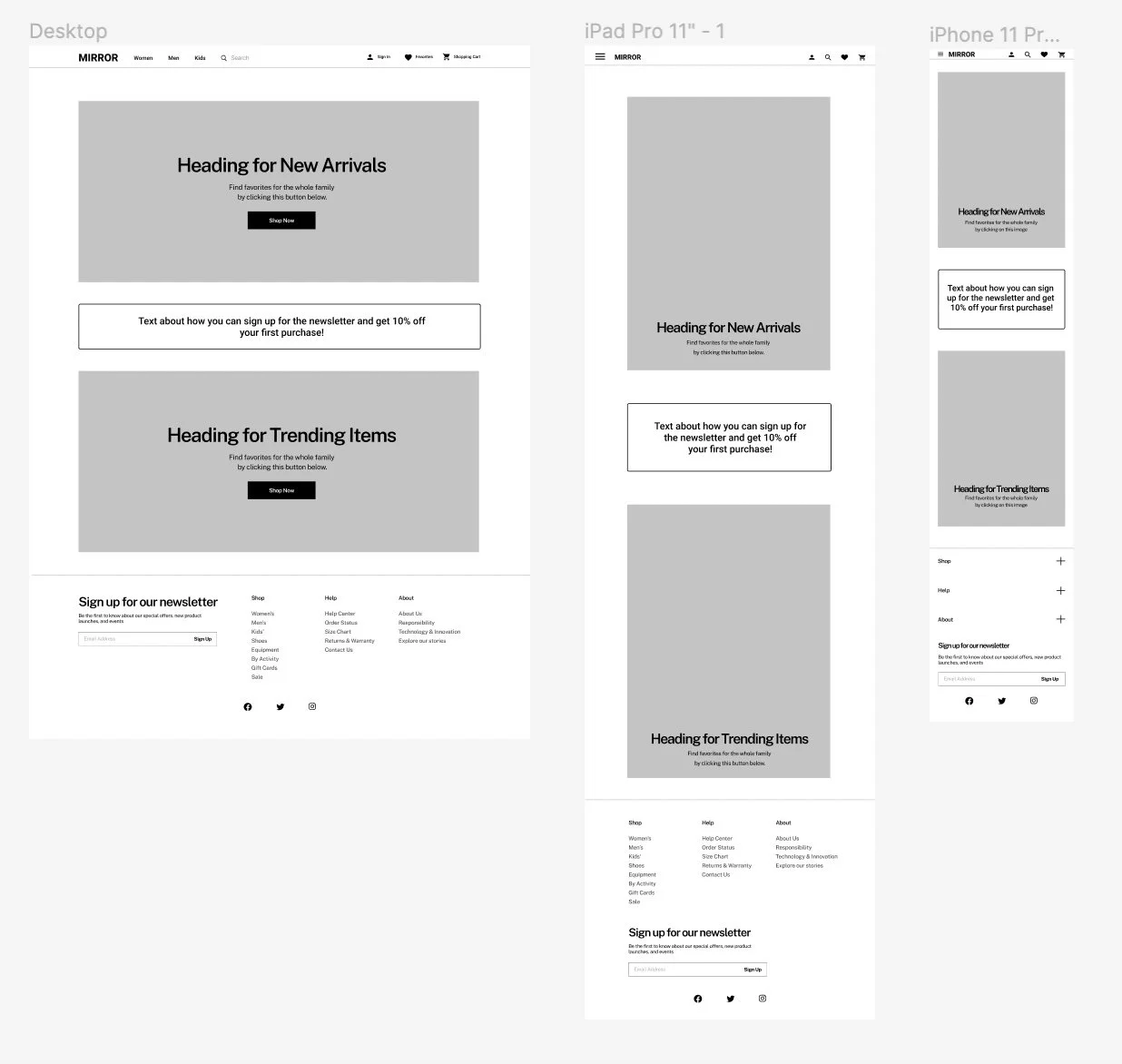
After completing the responsive wireframes for the landing page, I designed additional wireframes for the desktop website.

Branding and UI
As part of the design process for Mirror, I created a logo, color palette, and typography to be used throughout. Additionally, Expanding the style tile, I created a UI Kit which included layouts for the navigation, headers and footers. I also designed the look for the breadcrumbs, filters, pages and input fields.


Prototyping
In preparation for usability testing, I implemented the elements from my UI kit and made adjustments to my wireframes based on the feedback from my initial testing, in order to create a mid-fidelity prototype.

Test
Usability Testing
I recruited 9 participants for testing my Mirror prototype. Two of the participants were available to test live using Zoom and Google Meet. Unfortunately, I was unable to secure more in-person participants. As a result, I tested with 7 more people using Maze.
Objectives:
-Test Mirror’s website for ease of use
-Determine if users can successfully search for an item, add it to their cart and make a purchase.
Goals:
-Observe participants as they navigate the desktop site
-Determine if there is anything missing or confusing
- Do not offer guidance, so that users can complete the task independently

Iterations
After gathering feedback from my usability testing, and making a priority list for revisions, I made these changes to my prototype:

Filter Expansion Issue
I noticed that users tried to expand the filters in the lefthand column. I expanded the tabs so that users are able to see the pre-selected size and color for the user flow. The filter tabs are animated now in the prototype.
Pre-fill Confusion Issue
I removed the continue to shipping, continue to payment and pay with card buttons on the checkout page. The prototype is now structured to indicate that this information has already been pre-filled and the user can simply click the place order button.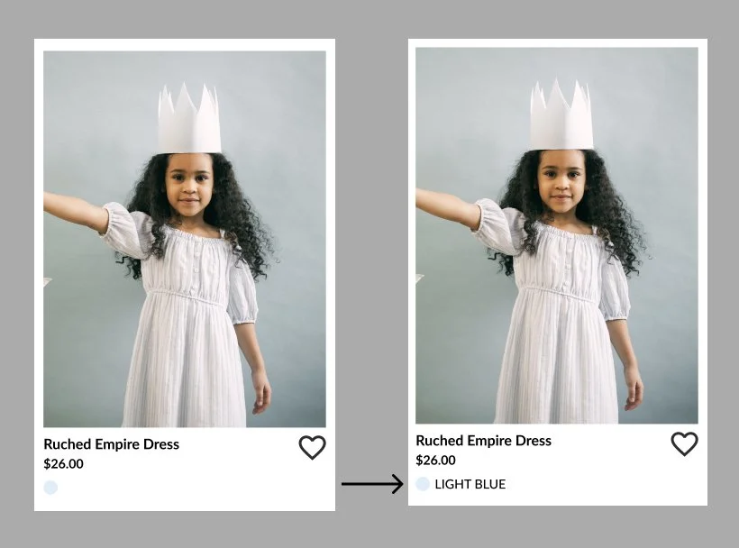
Colorway Differentiation Problem
During testing, users mentioned that it was difficult to determine an item’s color just from the circle below each image on the category and search results pages. To improve accessibility, I added color way text.
Missing Member Signup Issue
Users also wanted the option to be able to sign up to become a member from the shopping cart page. In addition to the member log in button, I added a sign up link.Prototype
Next Steps
-Make Adjustments
Make additional revisions including design adjustments, missing features and information, more photos, errors and suggestions based on user feedback
-Higher Fidelity Prototype
Include additional features in the Figma prototype to test (hover states, buttons, photos)
-Test
After revisions, perform more usability testing to gather more feedback so additional improvements can be made.